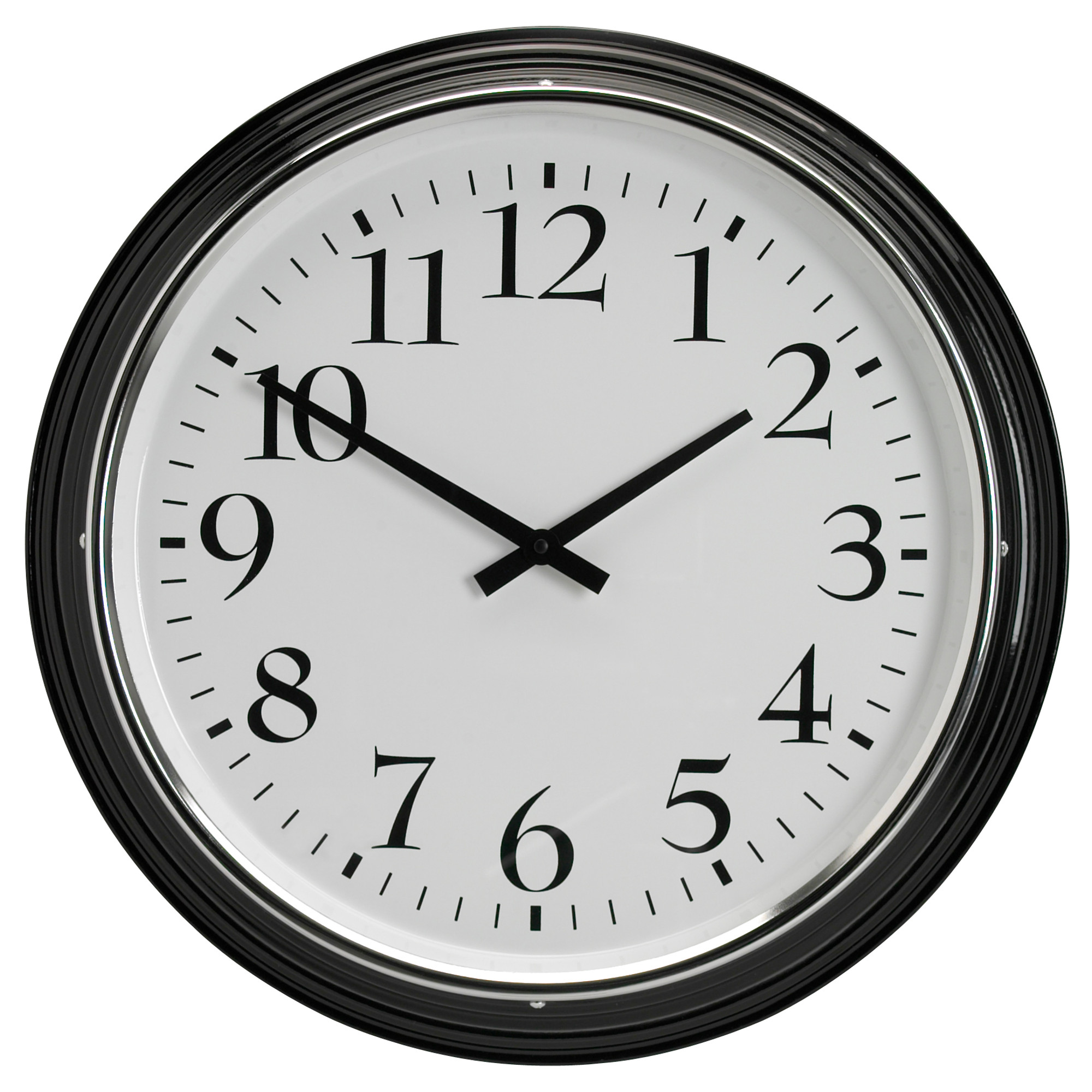
Clocks are horribly designed for user experience. The design of a clock is not intuitive. So much so that clocks are used by doctors to determine if a person has dementia. Stay with me and I will explain.
I listen to a lot of podcasts. In fact those that know me well would be surprised that it took me this many blog posts to mention a podcast. I like podcasts a lot and I listen to many different ones. I should probably start my own podcast called “This Podcast I Listen To” where I talk about all the cool things I hear week to week.
So, this podcast I listen to called, “This American Life“, interviewed an older couple and the husband, Carl, was recently diagnosed with Alzheimers. In their visits to the doctor, Carl is asked to draw an analog clock with such and such a time. This is a normal test that doctors do with Alzheimers patients. A patient’s ability (or inability) to draw a clock is one way they diagnose the disorder.
In the podcast, Carl is confounded and frustrated that he keeps forgetting how to draw a clock. He decided to sit down and figure out not just how to draw a clock but why he can’t draw a clock. His conclusion is that there are three different layers of information when you look at a clock.
- The hours are represented 1 through 12, even though there are 24 hours in a day.
- The 1 through 12 also represents minutes, but the 1 doesn’t mean 1 anymore and the minutes increase at increments of 5 i.e. 1 equals 5, 2 equals 10.
- The seconds hand is similar to the minutes and measures 1 through 60 even though it is still moving along the same path of 1 through 12.
Now most of us have been reading clocks since we were 5. It is something that we are taught and we practice over and over to figure it out. So at this point while I am listening to the podcast my first instinct is to think that the problem is Carl and his memory. The insensitive part of me says of course an Alzheimers patient can’t draw a clock, he has Alzheimers. But then the This American Life reporter (Chana Joffe-walt) says something that immediately makes me realize that this is a user experience problem.
“And he took apart each element of the clock until it made sense to him, the three layers, the fact that the eyes goes to the larger minute hand first and your brain has to override that focus on the smaller hour hand, which is actually more important even though it’s smaller and not the first thing you see. And then you’re supposed to move to the longer minute hand. But don’t be tricked because the second hand is also longer but it’s skinnier.”
When you look at a clock for the first time. You have to determine what information is the most important. Carl realized that there were three layers of information, but he still had trouble determining where to start and which layer is most important.
Our eyes are drawn to certain things first. We don’t realize it, but there are always things on products that draw our attention. On a clock, Carl says the minute hand grabs our attention first, but really we need the hour hand to determine the first layer of information. The fact that the minute hand has a grasp on our attention before the hour hand already sets us up for failure.
Since we have all learned how to tell time since we were 5, we have been desensitized as to how difficult it actually is to tell time on an analog clock.
Most of us can glance at a clock and immediately take in the information required to determine the time. Clocks are in reality a clever design. You have three different hands spinning around a single axis with 12 numbers and from that we can determine the time of day. It really is quite ingenious. But clever designs don’t always make for a good user experience.
I keep using the phrase “user experience”, from a design perspective we talk about user experience a lot. Google gives this definition for user experience.
“the overall experience of a person using a product such as a website or computer application, especially in terms of how easy or pleasing it is to use”
The user experience should be easy and for something as universal as a clock, it should be intuitive. Analog clocks are not intuitive. I think anyone who has tried to teach a 5 year old or has known someone with Alzheimers would agree.
The solution is digital clocks… Just kidding, I don’t know what the actual solution should be. I really like watches and the design behind them. I don’t want to get rid of analog clocks. I do think it would be interesting to try to design a clock with many of the same features that analog clocks have, but somehow change some of the critical components to make the clock more intuitive.
Maybe this is a problem for Roman Mars on 99% Invisible, another podcast I listen to all about design and the world around us.

No Comments